Hello,
I want to share some of my findings from an unforgettable trip to Japan in today's newsletter. This account is an extension of the notes I took during the trip and an abbreviation of the notes I shared with the team designing Ómós. Japan impressed, inspired, and overwhelmed me in so many ways, providing a great sense of connection and relatability. While I knew that elements of Japanese aesthetic and design principles were playing a significant role in the design language of Ómós (without ever wanting Ómós to feel Japanese), it was quite compelling to experience firsthand what I had only ever learnt from books and online to date.
Note: Due to the length of this post, it might be best to read it in the Substack app.
The Ómós Digest is a reader-supported publication, of which all contributors are paid. Please consider supporting this continued writing and research by upgrading to a paid subscription for €5 a month or €50 a year — Subscribing will give you access to the whole Ómós Digest archives — including our most read articles such as Sustainability Overload, Time to Replace the Brigade, The Best BLT Sandwich Recipe and many more.
I hope you enjoy it,
Cúán.
Japan behaves differently
From the moment we arrived in Tokyo, it was clear this trip would be different. Firstly, standing on the airport subway, I inquisitively watched a man read a book back to front: the text laid out vertically (known as tategaki), nodding as he read up and down the page, gradually from right to left. Then as we stepped onto the platform, the emerging slew disembarked and diligently joined a line of passengers in single file for their turn on the escalator. As we looked around, there were lines of people all over the station. When Japanese tourists come to Europe, they must be appalled by the ‘Western huddle’ that occurs at buses, street crossings, or sporting events to name a few. Although Tokyo is a city that dwarfs New York both in scale and population, the level of respect that permeates through its people equates to an environment that is full to the brim of attraction, yet does not pertain to the chaos of other major cities. Despite the great sense of law and order, it's not to say that Tokyo and Japan are not overwhelming - they absolutely are. It is such a vast cultural shift from Western society, that even this indescribable sense of peace is slightly unsettling at first. I mean, how on earth does a country without public waste bins have no litter issue? It turns out the Japanese take their litter home…
My tight 4-day schedule in Tokyo mainly revolved around hitting up as many bars and restaurants as possible, certainly more than any dietician might suggest. Any cultural experience that did not concern food was squeezed between mealtimes. Thankfully, our 20,000 average daily steps kept us fighting fit and ready for dinner. It also meant one full day felt more like three. Following two wonderful nights visiting friends in the Shiga prefecture, we stayed seven nights in Kyoto. This time allowed us to fully embrace the city, find our whereabouts and delve deep into its tradition, craft and nature. Kyoto is remarkably different from Tokyo. For instance, any tourist travelling from the capital will quickly learn that on Kyoto’s elevators, one stands on the right rather than the left like in Tokyo. The towering buildings and bright lights are replaced by traditional wooden townhouses known as ‘machiya’, with ornate box lanterns glowing in every doorway, housing what seems like an infinite supply of tea houses, cafés, restaurants and craft studios. I fell in love with Kyoto but have a serious soft spot for Tokyo, Shiga and Osaka too. Below are some of my thoughts.
Paving, floors and entrances
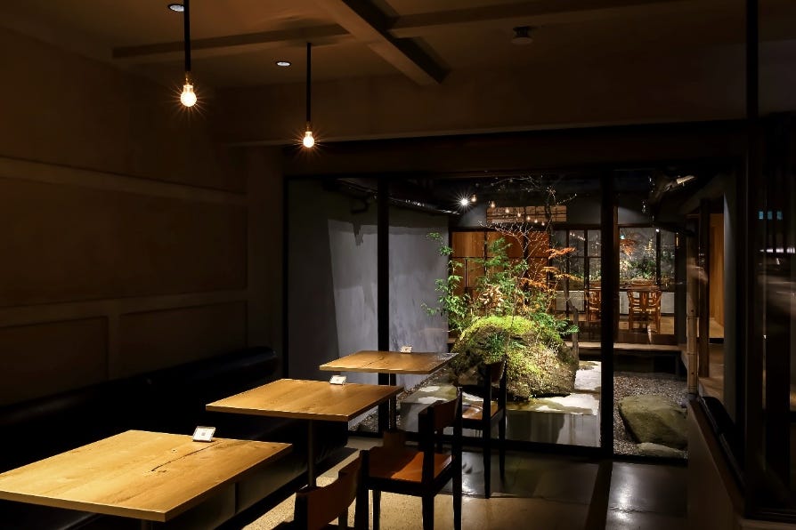
I was so taken with the gardens in Japan. In Kyoto’s machiyas (traditional townhouses), tsubo gardens are located in the entryways or courtyards to many coffee shops and restaurants. While meandering through Japan I found myself constantly stopping to admire and photograph these spaces. They are a beautiful way to bring nature into an urban environment, collect rainwater and for light ventilation.
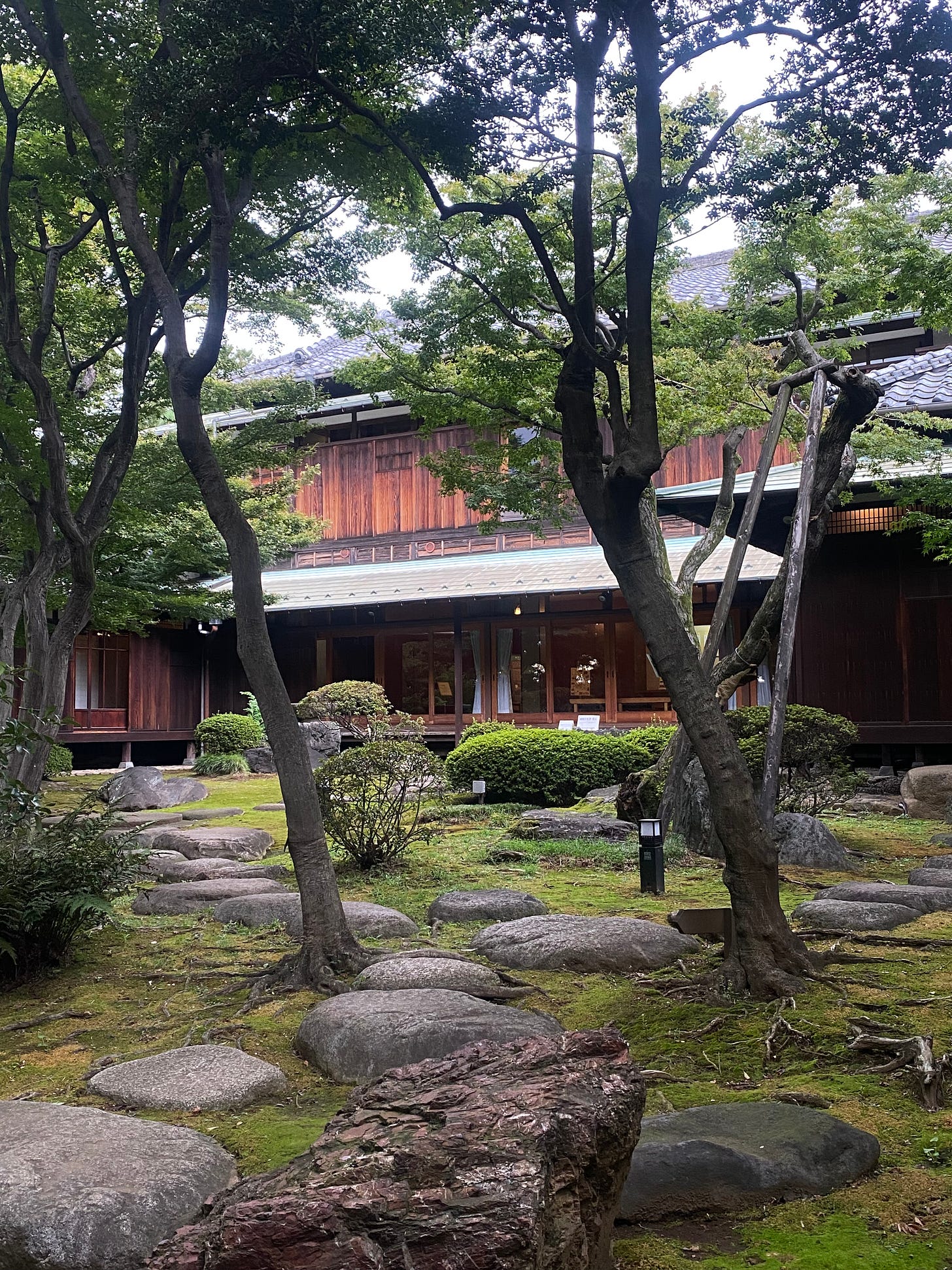
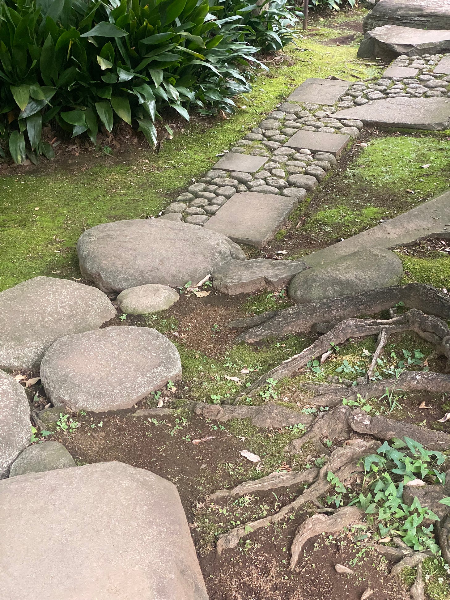
This Kyu Asakura historic house had a wonderful ornamental garden that was hugely explorative. The pathways both guided our eyes and feet.
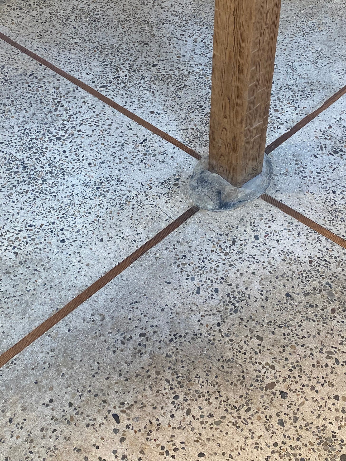
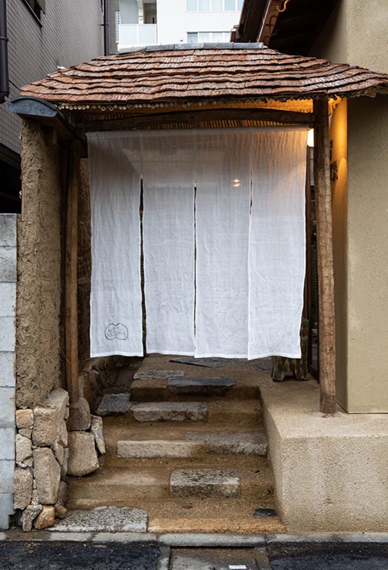
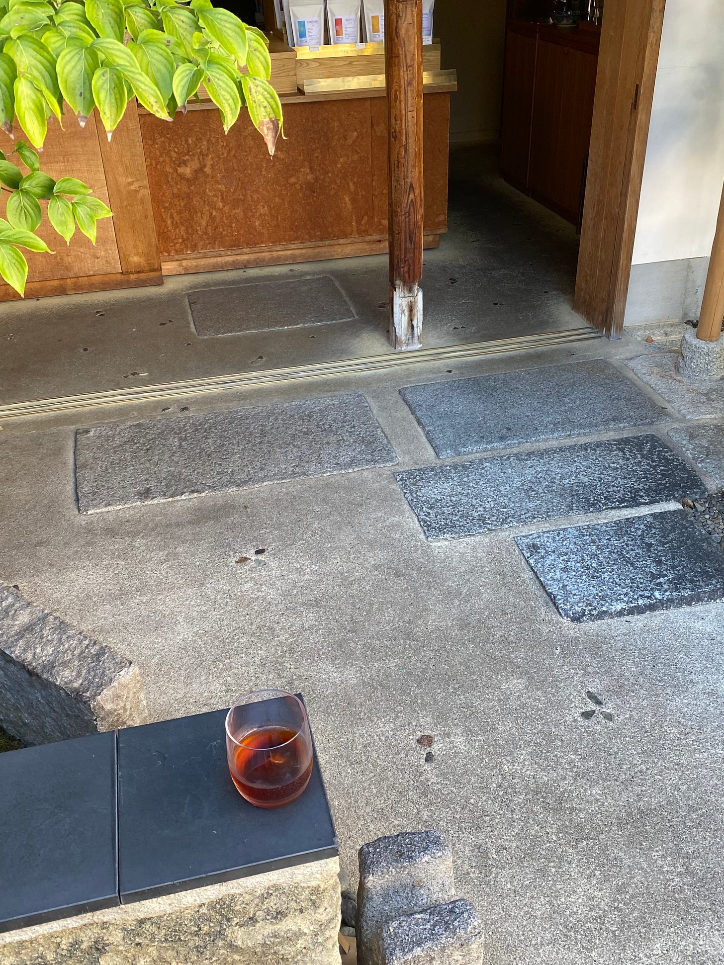
Throughout Japan, many pillars were scribed onto a stone plinth. I learned that this is called ‘ishibatate’ or standing on stones. It reminded me of work I had seen in New York by Ethan Stebbins at Les Ateliers Courbet. It was evident at Visvim in Nakameguro, Tokyo - in which the entire experience of visiting was highly memorable. It was the architecture that was so impressive; I wasn’t so taken with the clothing. In particular, the entrance caught my attention, that linen noren blowing in the wind, contrasting against the wood and cobbled wall.
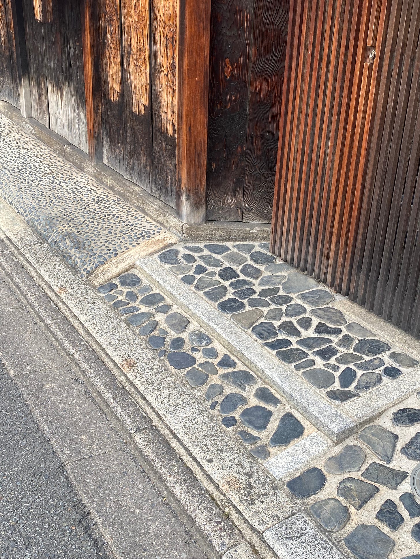
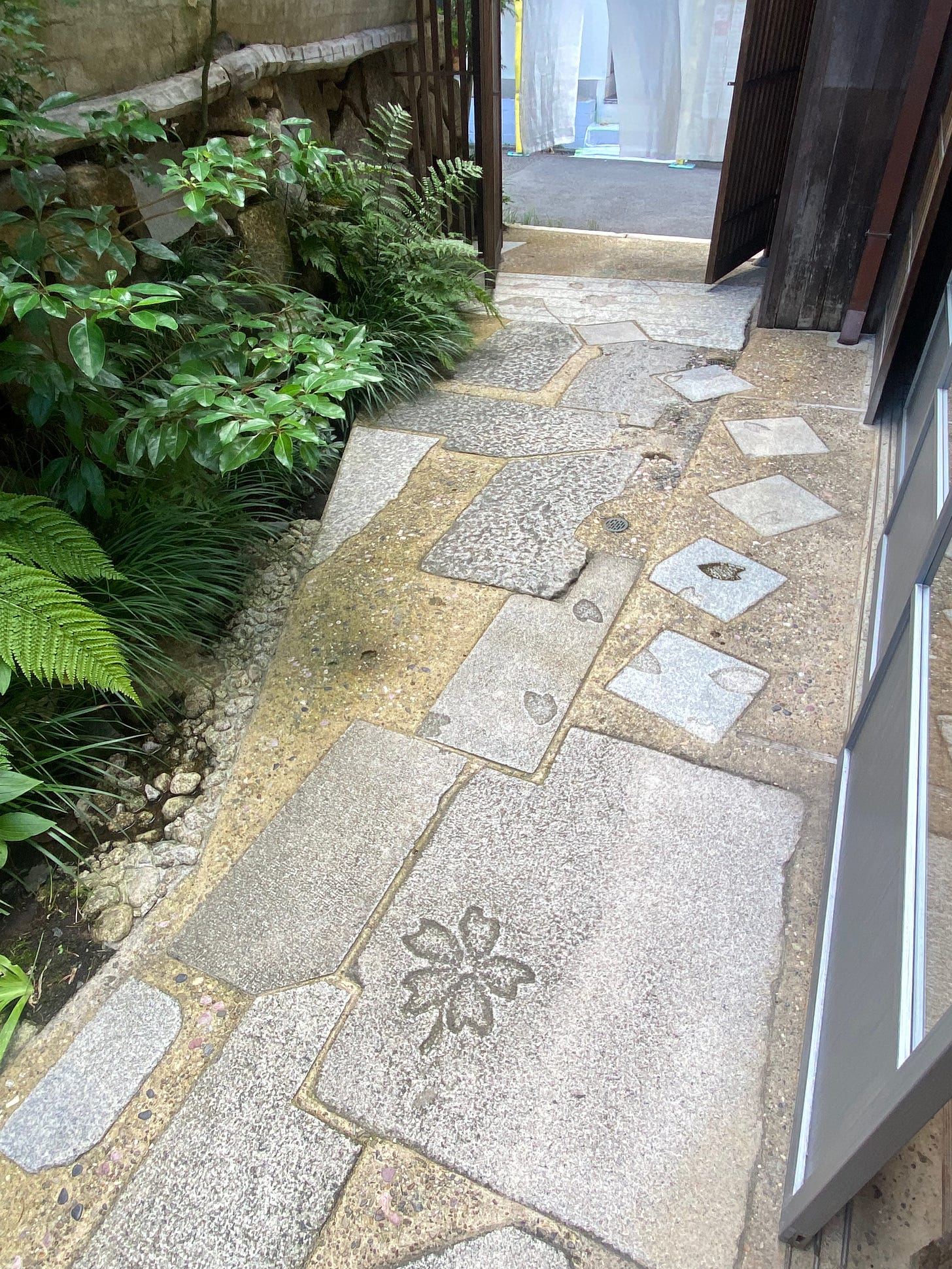
Many entryways to the machiya are cobbled: the size, style and scale vary greatly. It felt as if the cobbles were a reflection of the owner or perhaps the maker's personality or wealth.
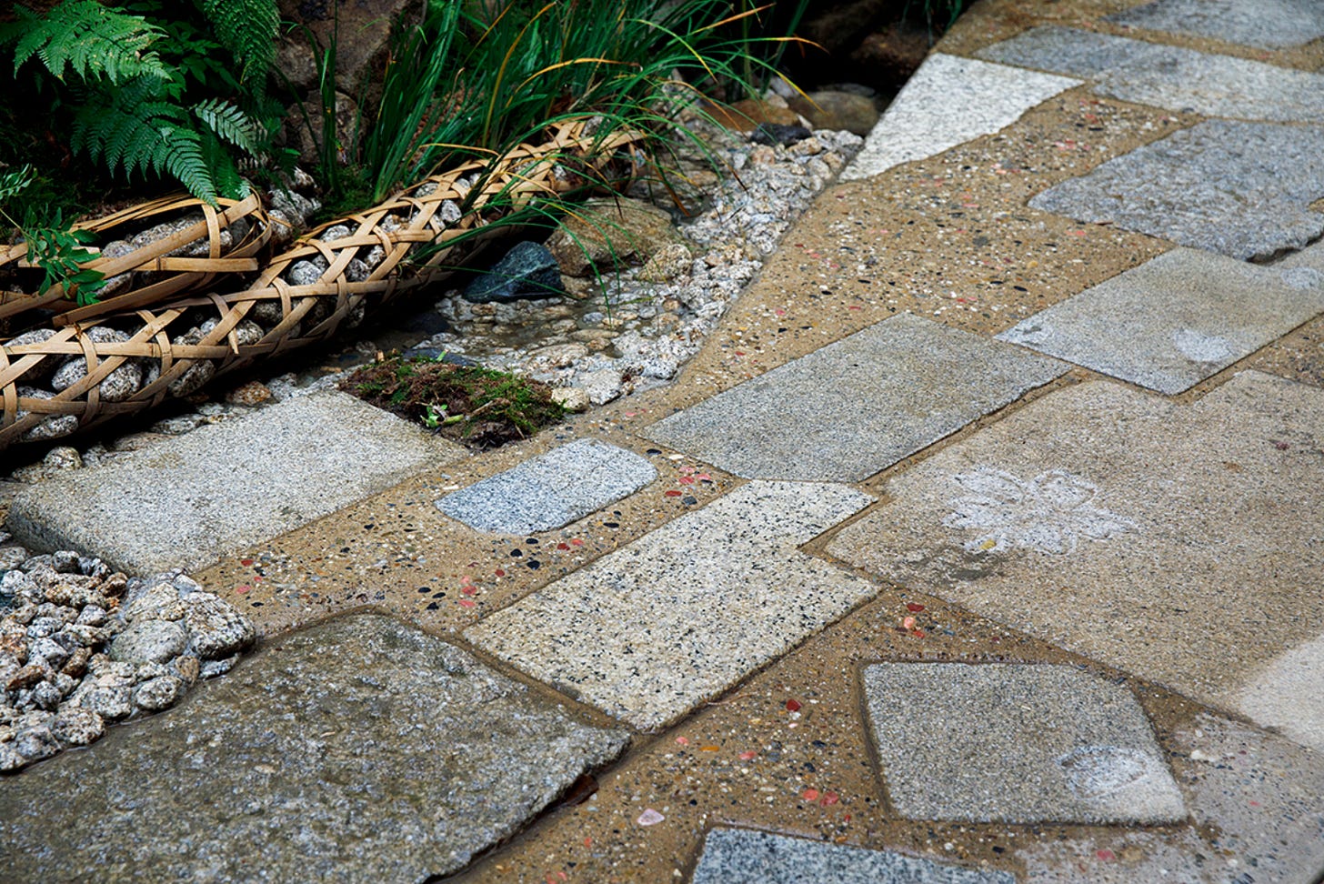
The Visvim garden was designed by Master Gardener, Sadao Yasumoro. He uses the term “designed by wind” when describing the almost accidental paving method used to design the footpath - meaning there is no specific process or intentional pattern. The flooring “which extends outside of the building, is laid with a mix of pebbles and mortar. During the setting process, it was washed with water prior to completely hardening, using a technique arai-dashi, creating a pleasantly flecked surface. In addition to those stones, old tile fragments from the original property are also embedded, a playful accent left by the craftsman.” - Visvim
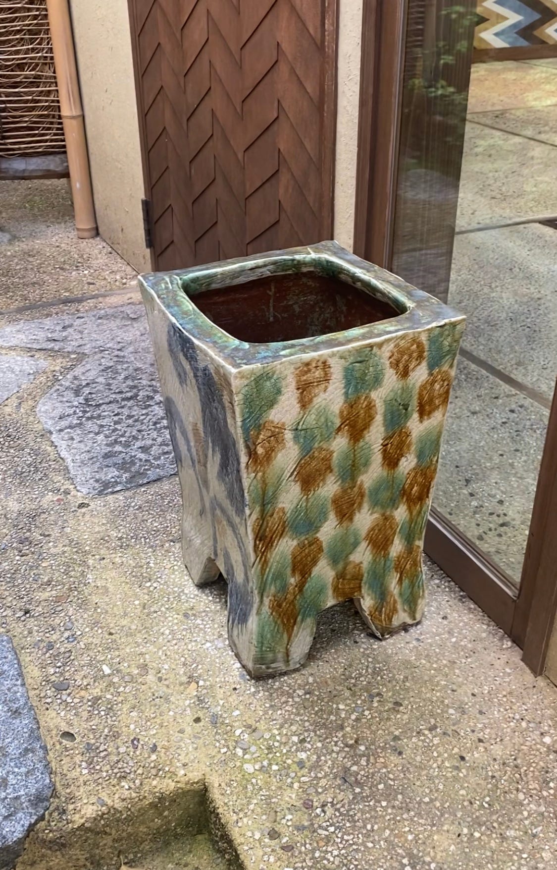
I then spotted this beautiful ceramic umbrella stand and following that, began to notice similar versions (but none as nice as this) in most doorways.
I thought the door was well crafted and the handle (a guest’s first physical contact with the building) understated but considered and very tactile.
Pathways are almost joyous in their craft. A great sense of play.
I visited Sower restaurant designed by Teruhiro Yanagihara in the Shiga prefecture, north of Kyoto. The chef and manager are friends of mine, who worked with Teruhiro on the overall vision. So much consideration had been put into the design. The result is a pretty perfect dining experience. I thought the entrance was beautiful with its triangular doorway and terracotta signage. Entering the restaurant, you immediately step into a bar (which is fine as the restaurant is located in a hotel), so there is no risk of draft from the front door. A natural and tranquil palette has been used, which for me really worked.


